

Two Style Frame Studies
Practiced replicating other designers' style frames by observing their style and creating a depiction that's not just a "copy", but a completely new frame that still fits the same visual look. I picked the style frames from the Design for Motion book by Austin Shaw.

My depiction of Madison Kelly & Marcelo Meneses' style
PROJECT - Make a Style Frame that Goes with an Existing Series, using ILLUSTRATOR
The first designers are Madison Kelly and Marcelo Meneses. They created an Adidas promo video as a project for their Motion Branding class at SCAD. They focused on how they could present it in different dimensions like horizontal, vertical, and square.
The style in this video is minimal yet bold, with a "call-to-action" aspect to it.
I thought it would be a fun challenge to try designing in this style.
I had gone through a few different compositions prior to the one I ended with, but I wasn't satisfied with them because they didn't feel "different" enough, and I felt restricted when I really wanted to let loose and play around with the possibilities. So instead of referencing so heavily on the compositions used in the original style frames, I tried thinking outside of the box. I changed things up by breaking the central alignment trend of the original frames, and set the text off to the side. I needed to balance it with another visual element, so I played off of the loop shapes and used those as emphasis on the shoe (as the designers had also done.) Then, I added the dotted circle to match the same visuals that they were using, and aligned it around "Run" for some more emphasis.
VIDEO USED FOR REFERENCE: https://vimeo.com/294806321
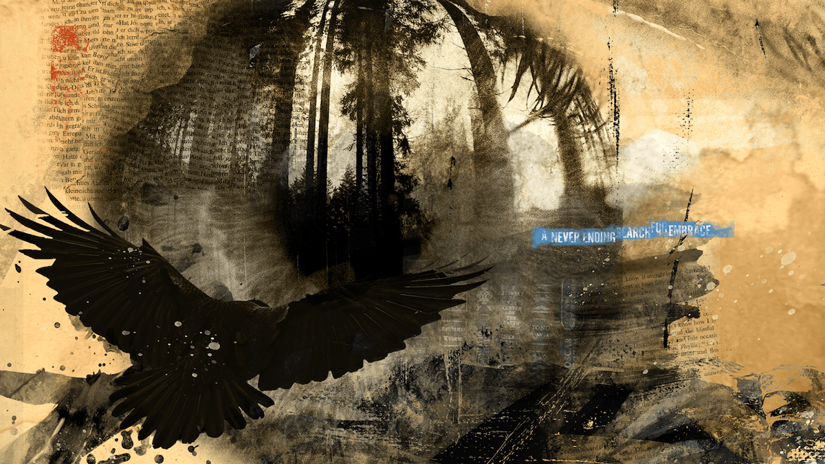
My depiction of Rick Kuan's style
SECOND PROJECT - Make a Style Frame that Goes with an Existing Series, using PHOTOSHOP
The second designer I'm referencing from is Rick Kuan. His style frames are like a collage of textures and mediums. They are thought provoking, poetic, and pensive. There's a limited color palette with stark contrast, and an artful use of negative space to draw the eye. When I first saw the second style frame (with the larger eye), the reflection of the eyelashes almost looked like a forest to me, so I played off of that idea. The muted color palette, brushy textures, and imagery of ravens were fitting with that idea as well. While designing my style frame, I kept all of this in mind, from subtle changes in color, to the composition and typography. I really tried to integrate the forest reflection on the eye in a way that blended in effortlessly. I wanted the reflection of the eyelashes to merge with the pine branches of the trees. I also tried to get that washed texture using masks and blending modes.
PHOTOS USED FOR REFERENCE - Taken by me from Design for Motion by Austin Shaw, designs by Rick Kuan


